Sunday, December 5, 2010

Joel Trussell


Joel Trussell was introduced to me in class while watching the video for Jason Forrest's War Photographer. The video features a flash animation of vikings dueling to the death with heavy metal guitar solos and crazy trumpet breaks that shoot out rainbow colors. The simple and authoritarian line of Trussel's figures immediately caught my eye and left me hungry for more.
The Tennessee native majored in drawing before moving to Seattle where he took classes from Jim Coffin and landed a job as an animation director at SmashingIdeas to work in the corporate sector for a few years before moving back home with his family. The artwork of Joel Trussell has a fabricated retro feel to it. There is a certain mocking tone in his illustrative voice that lends itself to conjuring the advertising of the early fifties and then parodying the cold war culture that branched from it. He has done work for numerous outfits such as The History Channel and the famous children's show Yo Gabba Gabba. At its very essence the work of Joel Trussell brings the artistic potential of programs like Adobe's Flash to the forefront of our minds. It makes secondary the idea that these programs are simple web development tools with business applications. The cast of characters used in his portfolio have humor at their heart. Whether it is a fearsome but bumbling viking or something more like the strutting centaur in the picture posted above. It is interesting to note that Trussell lists Looney Tunes as one of his earliest influences ( interview) and also sites the shows ability to make someone else ( his father) laugh as a major influence as well. The brilliant solutions to the mundane are the driving force behind his offbeat and brilliant artwork.

kamikaze Girls


Kamikaze girls is a Japanese book written by Novala Takemoto in 2002.The book which was also turned into a film and Manga centers around a young girls named Momoko Ryugasaki Who is obsessed with the French art movement of Rococo ( sampled in the picture of Fragonard's The Swing) the story highlights the contrast between the modern day culture of Japan and that of mid-18'th century France. Young Momoko Ryugasaki enters into the story obsessed with baby doll (Lolita style) clothing and the idea of living with ideology of pleasure being the ultimate goal of life. She sells her yakuza father's fake Versace clothing and thus meets the irreverent Ichigo "Ichiko" Shirayuri who is a female gangster with her own scooter gang and the two form an unlikely union. The insane fashion styles and wildly eccentric characters of the tome make the film version a virtual smorgasbord for the eyes. Stylistically this film comes off as a sort of asian version of the 2001 french film Amelie ( by Jean-Pierre Jeunet). Especially when you compare the two motion picture's scenes that illustrate the tales of the main character's childhoods. Although Kamikaze Girls is distinct in it's use of animation to tell the tale of the origin of the girl scooter gang (slightly reminiscent of Kill Bill meets Power Puff Girls) and it's visually arresting use of slow motion in the opening scenes. The quirkiness is an enjoyable reprieve from the blandness of most current films and the frilly approach to the hedonistic tale is not unlike the movement of Rococo itself.

Marjane Satrapi


Marjane Satrapi is french comic book artist and writer who was raised in Iran after being born there in 1969.
She started her body of work after moving to France in 1994. While there she began work on her best known pieces which became the graphic novels of Persepolis (parts 1 and 2 in the U.S. versions). It is said that her visual style is culled in part from the artwork of her husband Pierre-François Beauchard (a.k.a.'David B.) It is also theorized that that her style is not completely unlike that of Art Speigelman ( author of the famous graphic novel Maus). Satrapi is unique in aspect thought and that is she produced the first comic book from the strictly Iranian perspective. Growing up in Iran under Ayatollah Khomeini and the extreme oppression that came along with it has forged a very unparalleled view of the world. Her characters (which are largely auto-biographical) have a strange familiarity to them which stems from (in my opinion) the subtly rounded and generic quality of the lines with which she executes her drawing. Satrapi has encountered a fair degree of success including having Persepolis made into a feature length animated film in 2007. Currently another film is in the works as she is taking part in the production of Chicken with Plums ( another one of her graphic novels)due to be released in 2011.
For the the time being Satrapi still lives in France with her husband and works on children s books for the most part.

Wednesday, October 27, 2010

Flang Metro Polis


Fritz Lang's Metropolis is a film produced in 1927 for the Universum Film AG. The film is reputed to be the most expensive silent film ever produced. It is also considered to be the crown jewel of Lang's extensive film career spanning over 60 years. The film is generally considered expressionist cinema but with the attention to detail and the sheer beauty it uses to represent the machinery that reigns terror in the film it could also be considered constructivist in nature. The inherent mistrust of the machinery (and also women) that is found in German Expressionism sprouted from the horrible carnage produced from WWI. It also came from the rise of industrialization that many feared would encumber jobs of the working class. If you add to this the rise of The Femme Fatale in late 19'th century art and you have a perfect recipe for the film's political leanings. The film has been considered to be only partially complete after many scenes were cut from it due to it's subversive nature. In 2008 a version of the movie was found that is thirty minutes longer than any known copy that was thought to have existed. Found in Argentina and restored in Germany it is now available in 2010 to the common viewer so they can take in Fritz Lang's original vision. The general feel of the film as it tackles the struggle between the working class and the ruling bourgeoisie lends a tense feel to the film. The cold and demonic characterization of the machinery is typical of the mistrust of technology but the beautiful manner in which it was executed is a great example of the onset of modernism.

Vignelli


Massimo Vignelli is an Italian designer from Milan. He is probably best known for his 1972 re-design of the New York subway map. Although the reinvigorated design was only used for 7 years it had a lasting effect on how good design can reorganize visuals and incorporate simplicity into our life in a manner that perpetuates ocular pleasure. Vignelli is a designer who is still working today. He runs the Vignelli Associates design firm in New York City with his wife Lella. The couple have perpetuated design with a modernist leaning from there since 1971. Before that Vignelli started the New York branch of Unimark international which was a standard in the ad industry for many years and came up with powerful logos such as the American Airlines logo. His extensive work in the fields of furniture design and even architecture have yielded his famous remark " If you can design one thing you can design anything." This has held true across the years as the Vignellis have dipped their hands into countless forms of design. One such example of this is the Stendig calendar which Massimo produced in 1966. The calendar starts on Monday (in keeping with European tradition) and is characterized by it's monochromatic typefaces which
alternate from black to white as the months change. The large bolded font is characteristic of Vignelli's love of typography and is still in use all these years later. Vignelli changed the paradigms of modern design in America if for other reason than he took something as widely used as public transit and conformed it to the laws of good design by ridding the world of unnecessary clutter with it's strict adherence to the literal. I think a strong correlation can be drawn between Massimo and Otto Neurath

Jugend Magazine


Jugend was a munich based magazine that got its start in 1896 form the philosopher/artist George Hirth. The name comes from a term meaning youth and was taken from a magazine called "Die Jugend". The magazine held two distinct chapters. Before 1900 the style of the publication was laced with floral patterns and a strong influence from Japanese prints. After 1900 there was a strong leaning towards a more abstract form of artwork. The strong strokes and stringy lines were what gave birth to art nouveau in the early 1900's The magazine had a long run of publishing that lasted until the year 1914. The world wars and the extreme devastation they caused in Germany were to blame for the magazine's eventual demise. The artwork and the contributing artists that Jugend helped foster were capacious. Artists such as the overtly sensual Aubrey Beardsley had work in the periodical.The ever popular Gustav Klimt,who painted such pieces as the kiss and The Beethoven Frieze used the publication as a forum for his secession from the traditional Vienna Künstlerhaus which was the traditional art school of the time. The aspect of Jugend magazine that set it apart from other publications of the time was that it employed a high level of graphic design and also yielded four stronf fonts in the jugend style, or "Jugendstil". Those four fonts were Jugend, Campobello,Munich, and Phaeton. The integration of type style into the artwork was not necessarily a trait only used by Jugend but the innovative WAYS in which they incorporated the two is what made it a milestone in the area of graphic Design as well as art and Art Nouveau in general.
Marianne Brandt


Marianne Brandt was a German expressionist painter and sculptor who studied at the Grand-ducal College of Fine Arts in Weimar before becoming a student at the Weimar Bauhaus in 1924. She became head of the metal workshop in the year 1929 after being an understudy to Laszlo Maholy-Nagy. Brandt Brandt produced many pieces during her years a the Bauhaus including her famous Teapot and Sieve of 1924. Moholy-Nagy recognized her aptitude early on and fostered her talent through her studies. The metal workshop was also one of the few branches of the school which aided the financial income by producing various incorporated designs to such companies as the lighting firm of Körting & Mathiesen. Despite hard work and the general free-spirited nature of the school Brandt faced a large amount of adversity in the form of sexism among the students who thought little of women in an industrial setting. When you couple that with the general contempt shown to the school by the reigning political regimes you can see the difficulty she encountered to make her mark on the art world that we today take for granted ( i.e. the prevalence of modernism in good design.) After leaving the Bauhaus in 1929 she worked for a short period at Walter Gropius' architectural firm in Berlin designing furniture and working on interior design. She also worked at Ruppelwerke Metalware Factory in Gotha as the head of the design department until 1932. The Nazi party stifled much of her work until the end of WWII and then in 1949 she was provided an opportunity of a teaching position at the Institut für angewandte Kunst in East Berlin. She taught there from 1951-1954 and reputedly went back to her original love of painting after abandoning it years before for the allure of sculpture and design. In later years much of her work in photomontage was hailed for it's provocative accounts of Germany and the Bauhaus.

Wednesday, September 29, 2010


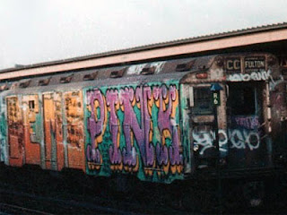
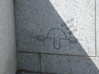
The history of graffiti can be traced back to cave paintings and can be considered among the first true marks ever made. The modern day inception probably came much much later in the late forties with the introduction of Kilroy. Kilroy made his mark on bombs he inspected by writing "Kilroy Was here". These bombs could be likened to the trains of New York in the way that they traveled great distances and were seen by many. Many G.I.'s in Europe would write "Kilroy was here" on walls as they took back cities from the Germans. Graffiti as we know it today probably got it's start in the 60's as social protest was getting it's foothold in America. The peace movement as well as the Black Panther movement both gave rise to various forms of vandalism. The true version of what we have ingrained in our heads as graffiti came from kids in the boroughs of New York. In the 1970's kids discovered that "tagging" the trains in the yards at night meant that their message or more likely their name could be seen by people all over the city, state, and even the country. This moving canvas led to a renaissance in the art form. Today the graffiti movement is still very much alive and has seen a leaning towards protest and the fight against commercialism and war with artists like Banksy and Ron English. Many older artists have seen validation as their once outlawed art has become more accepted by the mainstream.

Tuesday, September 28, 2010

Kubrick


Saul Bass' poster for Kubrick's (not King's) The Shining is the first thing I want to point out about Kubrick. It is the joint effort of two fantastic minds.

I think that there are many things to be said about the effect of Stanley Kubrick in relation to art. In particular his contribution to the field of design is interesting and long lasting. Not only did he pioneer the future in films like 1968's "2001". He helped institute his own personal vision of the emotion derived from spaces in films like "the Shining" and "Full Metal Jacket" his apparent love of the typeface Futura bold as connoted from movie posters from films like "Lolita" and "Eyes Wide Shut" says volumes about his attention to detail and his love of graphic design. The fact that he incorporated such attention to detail into his films (as in the space station in 2001 and the Overlook Hotel in The Shining) gives the viewer a sense of reality and aids in the suspension of disbelief. The interesting aspect of his films from a design standpoint is that through his careful integration of the art form he has succeeded in inspiring generations of artisans almost subliminally. Before I ever considered becoming an artist I was inspired by the milk bar in Clockwork Orange. Before I ever reveled in the joy of typography the heart hammering disorientation of "All work and no play makes Jack a dull boy" etched itself into my memory. In a modern age the film maker stands as a first line of defense against bad taste.

EC comics


When I was a young boy growing up on a navy base in Iceland my mother ran the magazine department of the local exchange. Some days she could not find a sitter and I would be toted along with her to roam the racks. At the time (1981-1982) there was no Tales from the Crypt or Haunt of Fear to be found so after reading all the disney comics and the occasional G.I. Joe I would tempt fate and sneak over pick up that months issue of Savage Sword of Conan. Sometimes I would get really adventurous and try to get a a glance at Heavy Metal. When I got caught it was corporal punishment time but I don't think that ever stopped me. I can Imagine that kids from the time of the introduction of horror comics in similar positions. Instead of people like H.R. Giger and John Buscema kids from the early 50's and late 40's were probably getting in trouble for artwork from people like Johnny Craig. Up until the late 40's comics had been geared mainly towards very young males. After WWII there turned out to be many soldiers who were showing an interest in reading issues with more adult themes than Superman. EC comics pioneered the field of horror comic books and took up the slack in marketing to an older crowd. As per usual with anything that leans away from typical church-going God fearing "King Jamesishness" The powers that be persecuted the makers of E.C. comics and all of their many different titles including the classics "Vault of Horror" and "Tales form the Crypt". They did this by the creation of a group not completely unlike the MPAA called the Comics Code Authority. Otherwise known as the CCA the group which formed in 1954 was an integral part of calling an end to the EC group with it's overbearing censorship. Through the years many of the great classic titles from EC have been re-issued and made into films (like the three Tales from the crypt films) and even a very clever T.V. show on Home Box Office. I still have memories of a local bookstore called Hawsey's Book Index that until it was taken over by a devout family had many torn and tattered issues just laying about on the shelves for only a quarter. The thematic element of these comics in addition to their outstanding artwork and shock value has made them an integral piece of Americana.